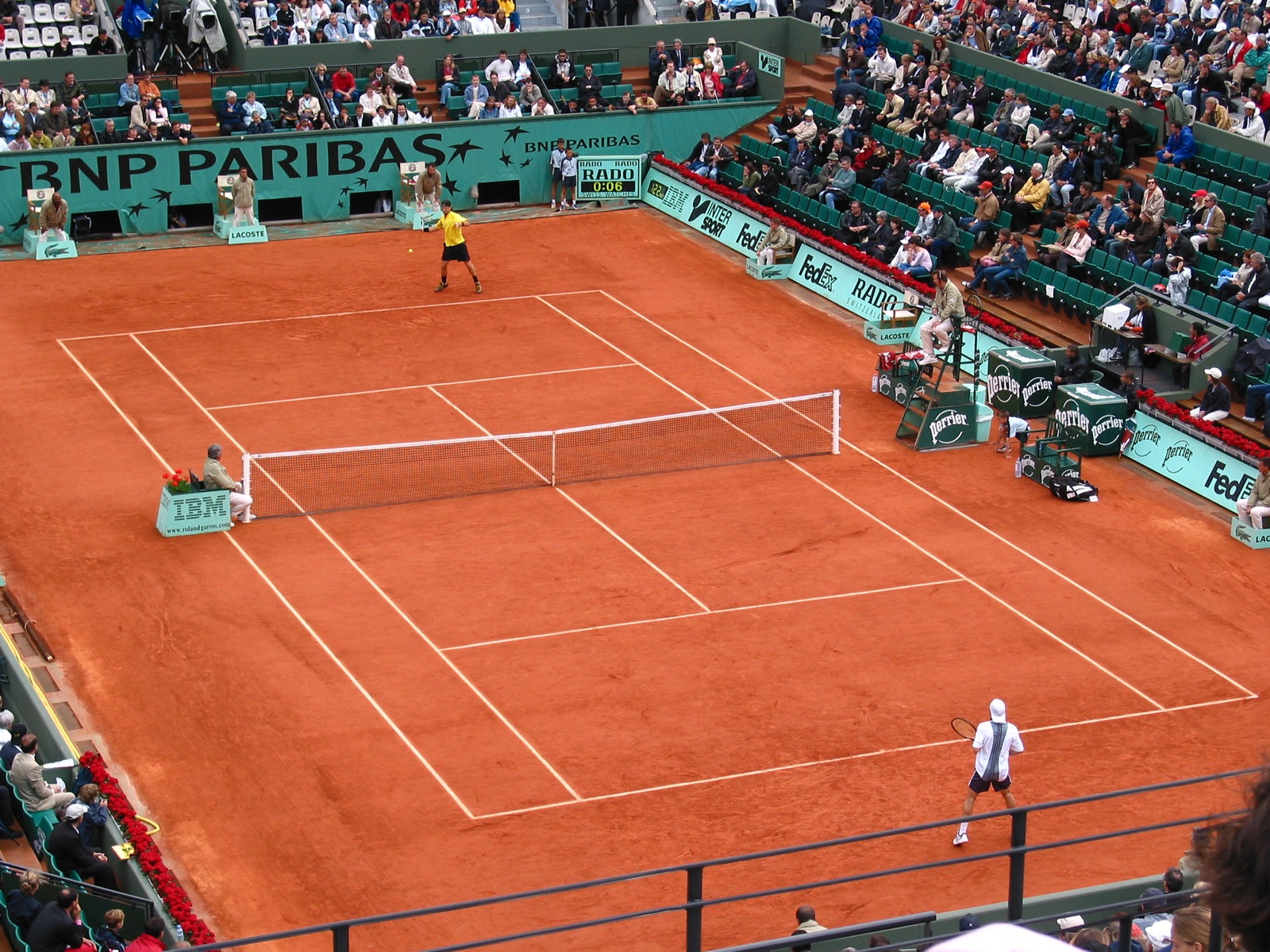
I was watching some tennis on the weekend and noticed that advertisers are required to change their brand colours to suite the basic French Open colour scheme. At first I thought this was just a "European" angle on advertising as I remembered being told a story about a town in Germany that managed to force McDonald's to change its logos and general colour combinations to suite the style of the town.
After doing a bit of searching on the tubes I couldn't find any pictures of that town, so you will have to believe me. What I did see is that the Australian Open didn't go to the same extents as the French Open. Here is a image from the Australian Open and here is one from the French Open. While the difference isn't significant, the French Open setup was a lot easier on my eyes with the advertising blending in and creating a much nicer visual experience.
If only we could start getting some websites to care about how much advertising affects their overall visual experience.
Showing posts with label advertising. Show all posts
Showing posts with label advertising. Show all posts
Monday, June 2, 2008
Subscribe to:
Posts (Atom)
